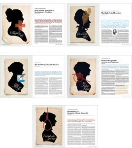


 One of Hammock’s favorite parts of helping the Daughters of the American Revolution to publish American Spirit magazine is finding those little-known stories of women of the Colonial and early American period. Because these women are under-represented in historical accounts of the period, we also don’t know what many of them looked like! Portraits were painted of First Ladies Martha Washington, Abigail Adams and Dolley Madison, but obviously those were unique circumstances. Francis Lewis, like many of the signers of the Declaration of Independence, had a portrait painted, but his wife, Elizabeth Annesley Lewis, one of the March/April issue’s featured women, did not.
Hammock won three awards on behalf of its clients in the 2017 APEX Awards competition, including its 14th Grand Award for American Spirit, the magazine of the Daughters of the American Revolution. Hammock has been the DAR’s publishing partner since 2002. The Source, HealthTrust’s member magazine, also won an Award of Excellence.
 Projects that received awards were:
Grand Award for Feature Writing for “Long May She Wave: The Story of Annin Flagmakers” in the July/Aug 2016 American Spirit
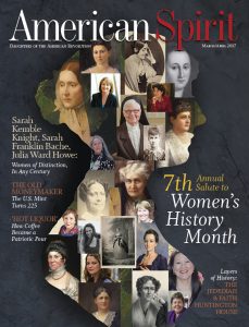
Award of Excellence for the cover of the March/April 2017 American Spirit, featuring its seventh annual issue devoted to Women’s History Month
Award of Excellence for Custom-Published Magazines: The Source Q3 2016
APEX Awards are based on excellence in graphic design, editorial content and the ability to achieve overall communications excellence. APEX Grand Awards honor the outstanding works in each main category, while APEX Awards of Excellence recognize exceptional entries in each of the individual categories.
Hammock won five awards on behalf of its clients in the 2016 APEX Awards competition, including its 13th Grand Award for American Spirit, the magazine of the Daughters of the American Revolution. Hammock has been the DAR’s publishing partner since 2002. Other award winners were The Source, HealthTrust’s member magazine, and the H2U newsletter, a custom-published health resource for members in select HCA hospitals.
Projects that received awards were:
Grand Award for Feature Writing for “A Lasting Legacy: DAR Schools” in the July/Aug 2015 American Spirit. (Written by Hammock’s own Emily McMackin)
Award of Excellence for the design and layout of the May/June 2015 American Spirit
Award of Excellence for Custom-Published Magazines: The Source Q4 2015
Award of Excellence for Feature Writing for “Combating the Antibiotic Resistance Crisis,” in the Q4 2015 issue of The Source (Written by Hammock’s own Megan Hamby)
Award of Excellence for Custom-Published Newsletters: H2U’s October 2015 newsletter
APEX Awards are based on excellence in graphic design, editorial content and the ability to achieve overall communications excellence. APEX Grand Awards honor the outstanding works in each main category, while APEX Awards of Excellence recognize exceptional entries in each of the individual categories.
 (On Rex Hammock’s RexBlog, a look at how we have developed the site SmallBusiness.com, and how we are using its lessons for other clients.)
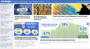
We just flipped the switch on SmallBusiness.com’s first major technical and design upgrade since launching its daily-content Main Page section last November. (We call the new section, the “flow” side, to balance with the “know” side of the site, the 29,000 page SmallBusiness.com WIKI.)
The design changes are various, depending on what size screen you’re viewing it. However, the technical changes are all about increasing the speed of the site. And they worked. So long, little engine that could, but we know there are plenty of bugs that will show up.
(Continue reading on RexBlog.com)
 Until last week, our new downtown Nashville offices* had been missing something vital: signage featuring the Hammock “H” logo. It was easy to figure out where to hang such a sign—our reception area is right off the elevators–but figuring out how to create it was a tougher decision. Our first choice was to commission a Nashville artisan whose hand-crafted signage was gaining regional appeal. Unfortunately, while we were talking with him, he went from up-and-coming to 100 percent “up,” and his backlog of work meant we’d go for months before getting on his schedule.
We decided then to go the maker route. Having abundant in-house design capabilities, our challenge was to find an artisan with laser-guided saw capabilities and the experience to transform our design files into wood signage. When we discovered such a company that also has mastered the type of post-advertising marketing skills we admire, there was little doubt we’d enjoy working with Oakland, Calif.-based Tinkering Monkey studios.

Though we’re not going to dress up in fancy ballgowns or tuxes with Stetsons and hand-tooled boots like the folks at the CMA awards this week here in Nashville, we at Hammock are celebrating with our clients over a clutch of MarCom awards for the work we are honored to collaborate with our clients in creating.
The MarCom Awards is an international creative competition for anyone involved in the concept, writing and design of print, visual, audio and web materials and programs. The program is administered by AMCP, the Association of Marketing & Communication Professionals. There were about 6,000 entries this year from individuals to media conglomerates and Fortune 50 companies.
Here’s what was in the envelopes:
I recently ran across an insightful essay named, “The best interface is no interface,” written last August on the blog of the San Francisco-based product design firm, Cooper.
I recommend reading the entire essay, but here is a key quote:
It’s time for us to move beyond screen-based thinking. Because when we think in screens, we design based upon a model that is inherently unnatural, inhumane, and has diminishing returns. It requires a great deal of talent, money and time to make these systems somewhat usable, and after all that effort, the software can sadly, only truly improve with a major overhaul. There is a better path: No UI (user-interface). A design methodology that aims to produce a radically simple technological future without digital interfaces.
At Hammock, we share a similar a point-of-view. We believe that one of the signs of great customer media and content is how well it removes barriers between customers and the organizations with which they choose to have relationships. Taken to its logical conclusion, the goal is to remove everything between the two, or, at least, to make it appear that transparent.
[Post by Rex Hammock]

According to one theory, the word ‘deck,’ when used after the word PowerPoint, is inspired by a deck of cards and serves a metaphor for how one can arrange and shuffle the slides created on software like PowerPoint and Keynote. However, anyone over the age of 40 or who has watched Mad Men knows that old-school presentation slides weren’t stacked in decks, but were placed in the circular part of a time machine called the Kodak Carousel.
On Wednesday, the White House posted an “enhanced version” of the President’s State of the Union address on Slideshare. (If you’re reading this on the Hammock Blog, it should be embedded below.) The enhanced version is a 107-slide, yes, 107-slide PowerPoint deck. As PowerPoints go, the quality of the graphics and design are superior to 99% of the PowerPoint decks you and I have ever endured. In other words, no deficits were reduced in the production of this 107-slide PowerPoint deck. (Have I mentioned there are 107 slides in the deck?)
But is a PowerPoint deck, even a great one, the best medium to use for after-the-presentation communications?
Read on, and you’ll understand why I say, “No.”
At Hammock, one of the things we do is work with large companies to develop sales presentation systems that are intended to help lead a customer to make the decision to buy a specific product or service. The presentations in these systems don’t merely run through concepts, and, most of all, they don’t just serve as an outline to remind the sales person the next thing they want to say. They sell something.
When we first start working with a client, the most shocking thing (to the sales person, at least) seems to be when we tell them this: Never give out your deck following a presentation!
Why is it shocking? Because that seems to be a universal practice. The prospect sees something they want to remember and asks politely and with interest, “Hey, can you give me a copy of this presentation?” The sales person, not having anything else to give them, says, “Sure.”
Seems harmless enough, so why would we suggest banning the practice?
Hammock provides content marketing services, which includes publishing print and digital magazines customized to meet our clients’ objectives. We study those objectives and work to ensure each issue of a client’s publication meets their specific goals. We accomplish this with expert writing about topics of interest to our clients’ target audience—and compelling design that brings to vivid life our writers’ stories. In the last month, these stories have included everything from historic re-enactors to the U.S. Marine Corps special ops and from the latest in pharmaceutical innovations to how health-care reform will affect supply chain managers. No matter the topic, our storytelling is tailored to the interests and passions of our clients’ customers and members. But we don’t just tell you that’s what we do—we’re always eager to show you. View our latest work for some of the publications we publish for our clients, including American Spirit, Semper Fi, The Source and Pharmaceutical Commerce.
At Hammock, we’re currently re-thinking the design, content — even the role — of our company’s primary website.
That’s not unusual. We’ve been rethinking it constantly since we first launched it in 1995.
I used to think a website — the design and structure part — should last for a couple of years. While I’ve always thought the content should constantly change, I thought the “look” and “feel” should stay fairly constant. Such a personal bias can be seen in my 10-year-old blog. Despite undergoing three or four significant re-designs and three changes in content management systems, even a regular reader would be hard-pressed to point out anything that has changed about the design of RexBlog. Being subtle with the changes sometimes is more difficult than a major overhaul.
I’ve also always believed (and still do) that different people visit a site for different reasons and a company should make the site’s navigation flexible enough for any of those reasons to be satisfied. Unfortunately, I’ve discovered over the years that no matter how flexible you make a site, it won’t work for everyone. So you keep trying.
Today, we’ve thrown out the two-year rule. Today, we accept the reality that a company’s website design and structure should be constantly reconsidered. Things change — rapidly. And the need to have a website change along with new ways people use the web should be a part of your approach to maintaining the site.