


Idea: You Can’t Control How Others See 50 Shades of Blue
Last week, an optical illusion related to a black and blue dress (or was it gold and white?) blew up the internet as people discovered—apparently for the first time—they can look at the same thing someone else looks at, yet see something completely different.
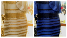 In addition to becoming an internet phenomenon (and hashtag), #TheDress provided a teaching moment for Pascal Wallisch, a research scientist at the Center for Neural Science at New York University, who used it to explain how the brain processes light bouncing off an object and perceives it as color. But the type and intensity of light and the context of the object can play jokes on our brains. And, like any joke, you may think it’s hilarious while your best friend doesn’t see the humor. In other words, we all perceive the same color in different ways. (On BuzzFeed, 3.4 million people participating in a poll say #TheDress is (A) blue and black, 32 percent (B) gold and white, 68 percent.)
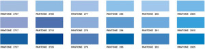
Years ago, while Marissa Mayer was still at Google, an article appeared in the New York Times about the way she tested 41 shades of blue to decide which to use in a navigation bar. Many people still use that as a benchmark for the lengths a marketer should go to make sure something works.
But there’s a “rest of the story” to the 41 shades test, as shared by Douglas Bowman, Google’s first visual designer. When he left Google to become creative director at Twitter, about the same time as the Mayer feature story appeared, he observed, “I recently debated over whether a border should be 3, 4 or 5 pixels wide, and was asked to prove my case. I can’t operate in an environment like that. I’ve grown tired of debating such minuscule design decisions. There are more exciting design problems in this world to tackle.”
What color should marketers see? Spending time fretting over slight variances in shades of color can never lead to the perfection desired, since factors including light source and context will cause one viewer to see it differently than another’s perception of perfection. Great products and helping customers better use those products are what makes the difference in marketing success. While we believe great design leads to great products and branding, we also think it’s always a good idea to remember that the beauty of color is in the eye of the beholder.
Which Square is Darker, A or B?
This is one of our favorite optical illusions for demonstrating the importance of context in a person’s perception of color (and many other things). We created this GIF to demonstrate the “you won’t believe this with your eyes” phenomenon.
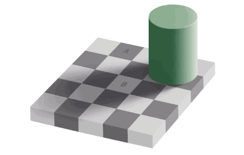
(Photo: Swaminathan via Flickr CC BY 2.0)
The Idea Email is distributed free, once every two weeks, by Hammock, the customer media and content marketing company. Please share this with friends and colleagues who can subscribe here. We respect your privacy, and each mailing includes a one-click unsubscribe link. We typically feature one or more companies and organizations in each Idea Email. If any company we mention has a relationship to Hammock (as a current or former client, for example), we will include a disclosure.
