
Graphical excellence is that which gives to the viewer the greatest number of ideas in the shortest time with the least ink in the smallest space. – Edward Tufte
By John Lavey
Whatever results come from the current legislative fight over the future of the Affordable Care Act, one thing is certain: This healthcare debate will be remembered for the sheer volume of visual graphics intended to translate dense data into charts and graphs that don’t require a degree in statistics to understand. Pioneered in the 1970s by graphic designers like Nigel Holmes and academic statisticians like Edward Tufte, this broad variety of data visualizations are now generally called “infographics.” (Except by Tufte and Holmes.)
Unfortunately, much of the healthcare debate infographics proliferating newspapers, magazines, blogs and email newsletters are less than informative. They are graphical, yes, but they aren’t necessarily informational.
What’s the difference? When I’ve sat with my phone and randomly started a text box full of emojis, I’ve created a meaningless graphic. But a text from my wife or daughter that uses an emoji to tell me they love me or the dog pooped in the house? That’s an infographic.
In healthcare marketing, I’ve witnessed amazing examples of simple infographics that help communicate highly complex information. They follow principles espoused by Tufte, the patron saint of graphical elegance that advances ideas. After seeing Edward Tufte speak in Nashville ten years ago, I’ve kept his two books, Visual Explanations and The Visual Display of Quantitative Graphics within easy reach in my office. Hammock’s team of designers are constantly studying ways to meet Tufte’s standards.
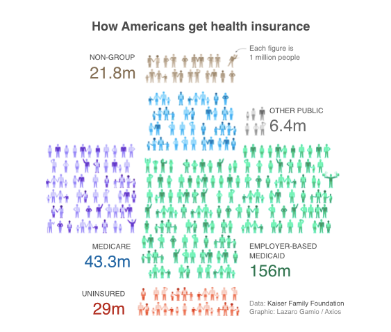
Here’s an example of a healthcare policy infographic from the news service Axios. It simply tells the story of the insured and uninsured in America, and clearly explains who is meant with the term, “people with pre-existing conditions.” It is smart story telling because the designer has, if you look closely, converted a bar chart into a recognizable healthcare symbol, the cross. It explains in a simple, yet creative way, the type of data that can easily overwhelm an audience.
Advice for improving your visualizations (infographics):
Here are three things to consider if you want graphics that simplify the story found in data and statistics.
- Infographics should start with the info, not the graphics. Make sure that your statistical story is correctly and accurately told with this short list of metaphor charts and graphs: pie, bar and line. Beyond statistics, limit your infographics’ role to explaining these four types of information: location, time, category and hierarchy.
- Ask a few people who have not been involved in creating the graphic, but who fit the profile of the intended audience, to look at the infographic and explain the story it tells. Do they explain it correctly? If not, your graphic needs more work.
- Follow the golden rule of visualizations (and joke telling): If you need to explain the graphic, it doesn’t work.
Image: Edward R. Tufte: The Visual Display of Quantitative Information
Photo Credit: Iwan Gabovitch/Flickr
About Hammock Healthcare Idea Email | This post is part of Hammock’s award-winning Idea Email series. Idea Emails are sent every other week and share one insightful marketing idea. Idea Email comes in two flavors: Original and Healthcare. To subscribe to the original Idea Email (general marketing ideas), click here . To subscribe to the Healthcare Idea Email (healthcare marketing ideas), click here.